top of page
Customer Service: Weekday from 10 am to 5 pm GMT-5 • Questions? Write us here
The rainbow, the representation of the natural diversity of Brun.
Food, Food
Branding, Identity
Menu Design.


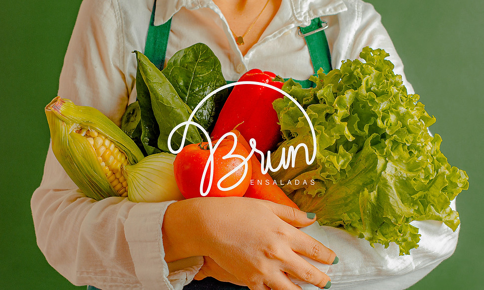
Thanks to Martha's salads, we got to know the magnificence of nature. Due to this characteristic, we focus on connecting elements of the earth that will represent the freshness of the products. Seeing the immense variety of ingredients gathered gives us the perception of seven tones, which we can appreciate in the rainbow. Natural and semi-concentric in shape, just like the calligraphic line that makes up the brand's logo.


Life and equity principle of happiness.
What is at the end of the rainbow? It is an unresolved mystery, however, we faithfully believe that in the end there is a Brun salad. Value what the earth gives us; It's the key. With the aim of strengthening the brand's storytelling and providing agility in reading the ingredients with which salads can be assembled, we designed a set of illustrations and icons that identify and guide the user to a better understanding of the concept of customizable salad.


bottom of page